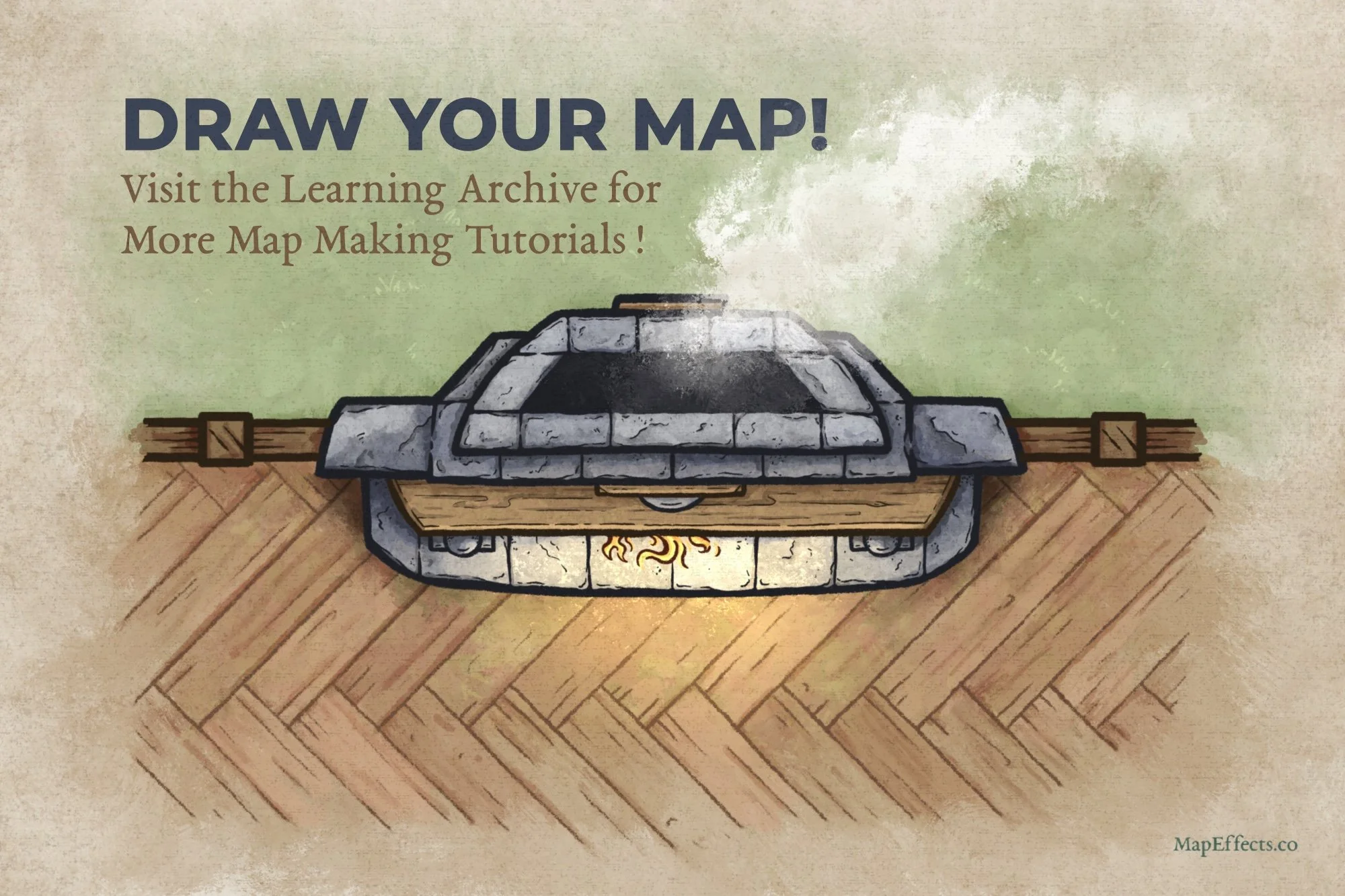
How to Draw a Fireplace

As you enter the tavern, you see a crackling fireplace casting a warm, golden glow across the room, its flickering light dancing on the worn wooden beams and inviting you to rest your weary bones after a long journey. The scent of burning oak fills the air, and the soft murmur of fellow adventurers sharing tales pulls you closer.
A fireplace like this isn’t just a detail, it’s a place to gather for your next adventure. But, how do you draw one on your map? In this tutorial, I’ll show you how to craft a fireplace that not only looks good but has a unique flair to fit your fantasy inn or tavern!
Want some free brushes to draw your maps? Get The Free Apprentice Brush Pack HERE
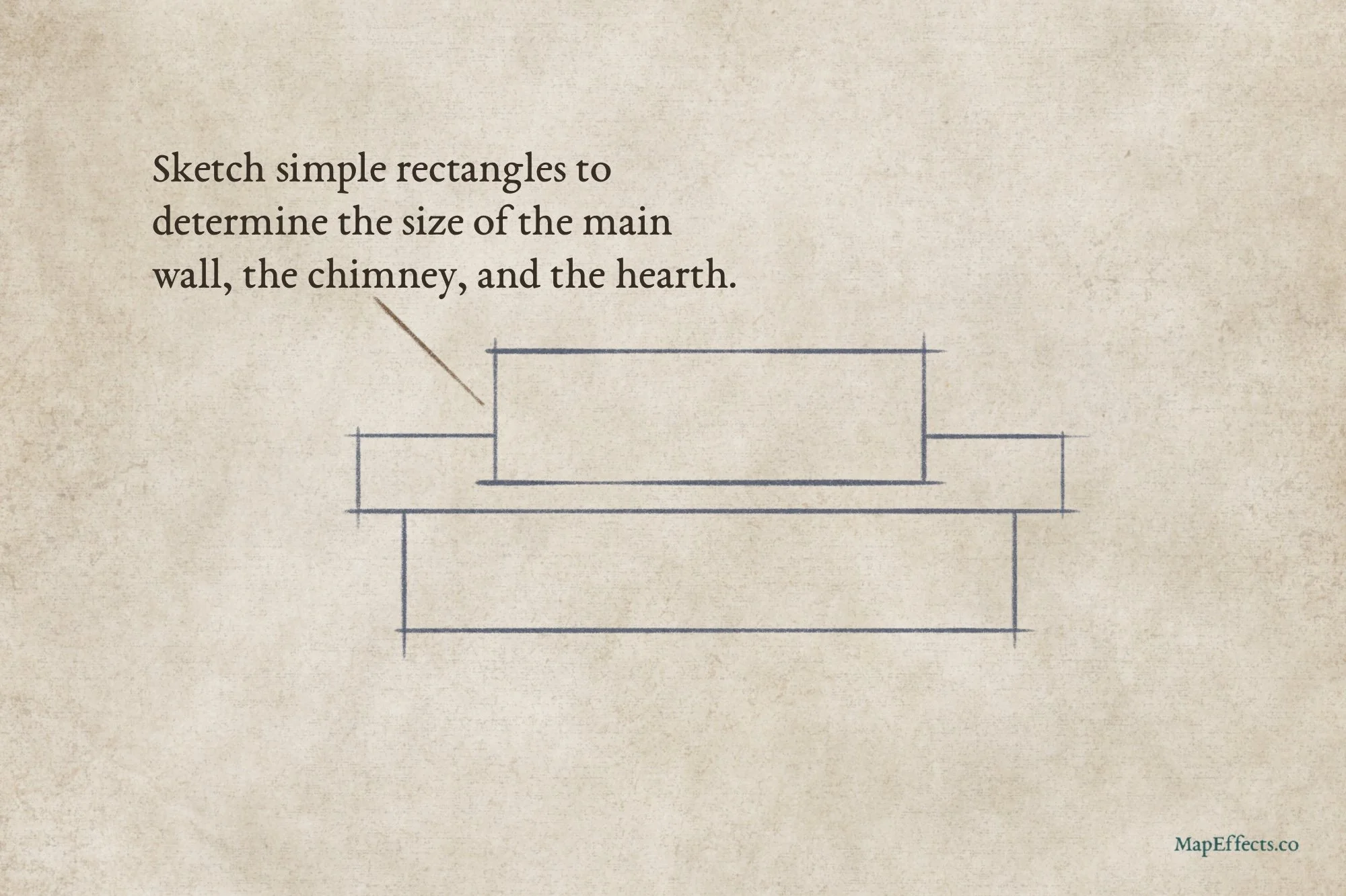
Sketch the Main Fireplace Shapes
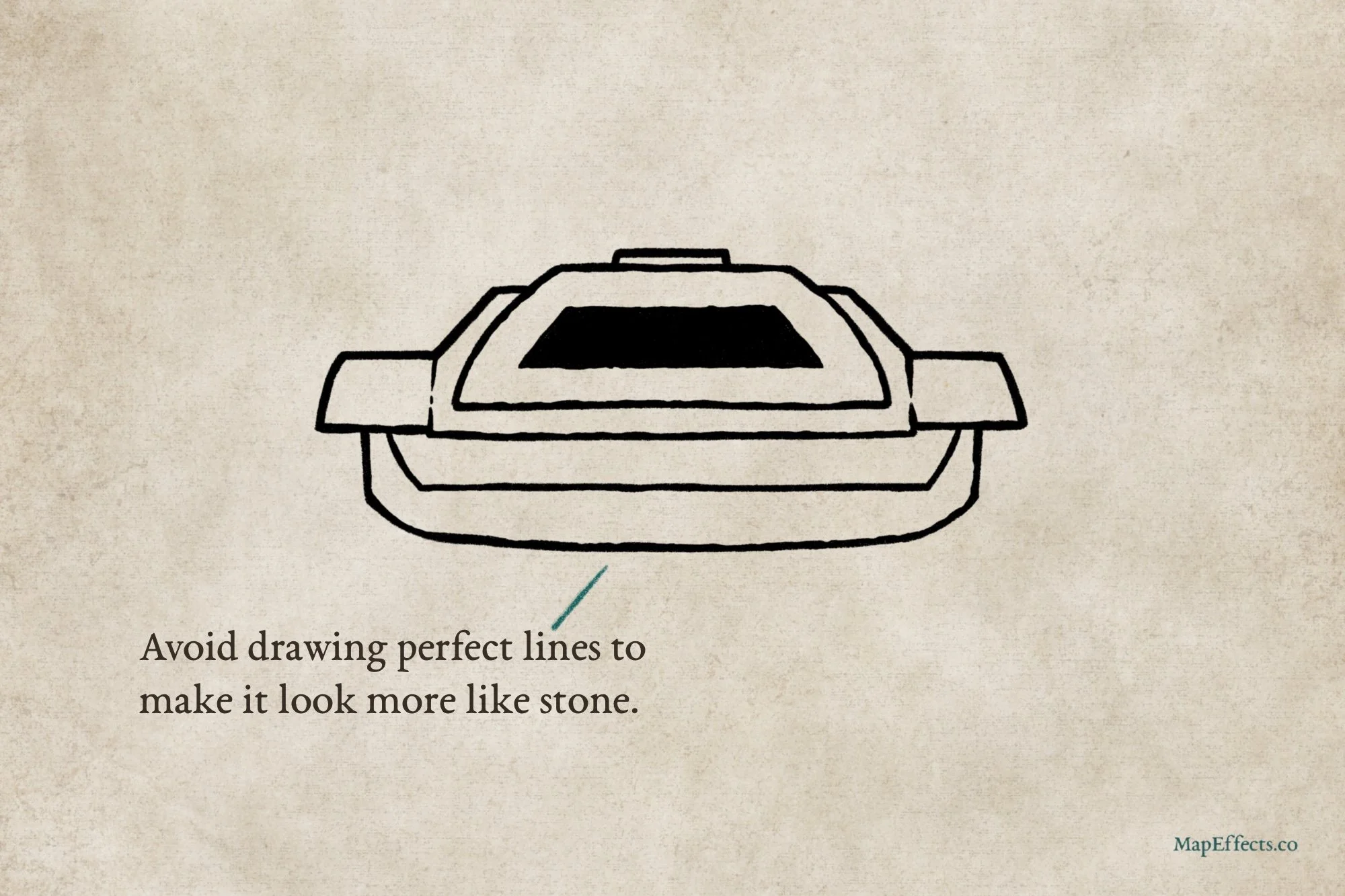
The first thing you want to do is decide on the overall size of the fireplace you want to draw on your map. Begin with some simple rectangles to show the chimney, main wall, and the hearth. Keep things simple right now before you start refining your shapes.
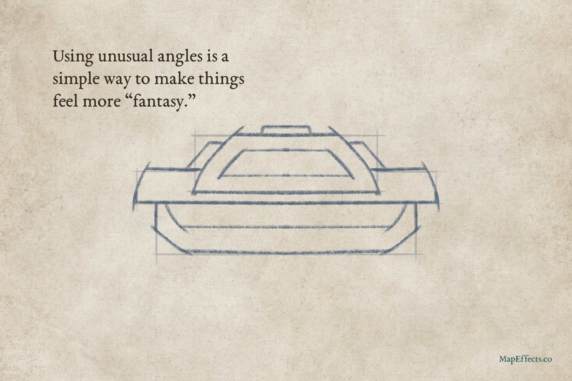
Refine the Sketch with More Unique Shapes
If you were drawing more of a typical medieval-looking fireplace, you may want to stick with a rectangular look. But, I want it to feel a little bit different since we are in a fantasy setting. Shaping just a few of the angles to have a bit of curve can go a long way to make a simple object stand out.
Ink the Main Outline
With your basic shapes in place, you can now ink the main line art. I like to use a thicker outline for the structure pieces, and will switch to a thinner brush as we move into the details. Having a good variation in line width gives a little more character and helps make it visually interesting. I prefer a brush pen if I’m drawing on paper, or a pressure-sensitive brush if I’m working digitally.
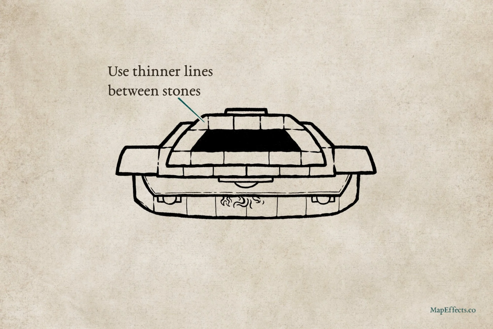
Draw in the Stones
Switch to a thinner brush and add some divisions on the fireplace to give the impression of stones. Don’t be afraid to allow little breaks in your line which gives some texture. You’ll notice I’ve also added a couple of simple details like a wall hanging above the mantle, a couple of pillars on either side of the fireplace, as well as the fire itself.
It’s worth mentioning that “realistically”, you probably wouldn’t see any of the flames coming out of the fireplace in a true top-down perspective…unless they were billowing out and likely to set fire to the whole room! However, this is one of those moments I think you can take some creative liberty to show a few flames just because it’s more visually compelling.
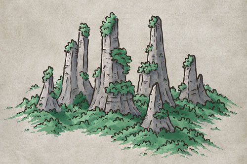
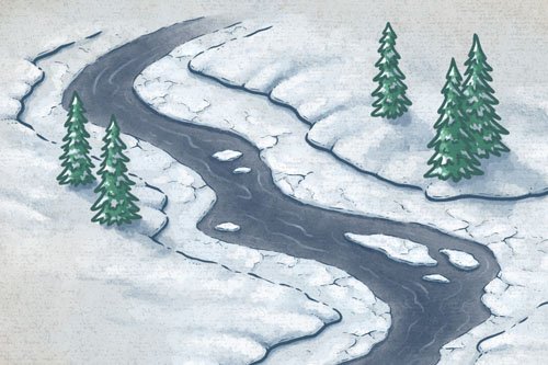
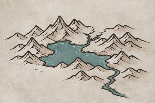
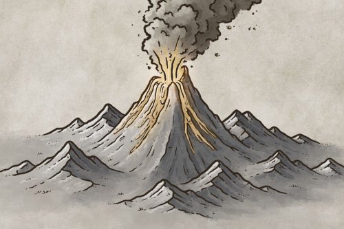
More Mapping Tutorials
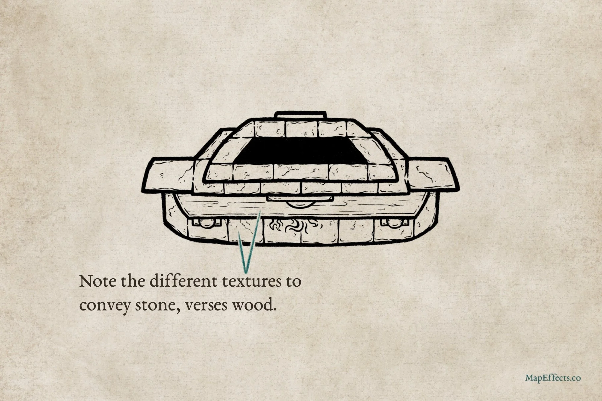
Add Texture to Stones & Wood
To finish up the line art, you can add a bit of texture to the stones and the wood mantle. You’ll notice that for the stones I like to use more random broken lines and stippling, while the wood has longer, flowing lines to convey a bit of the grain. This will vary if you want to illustrate a different species of wood or types of stone, but this is a good place to start.
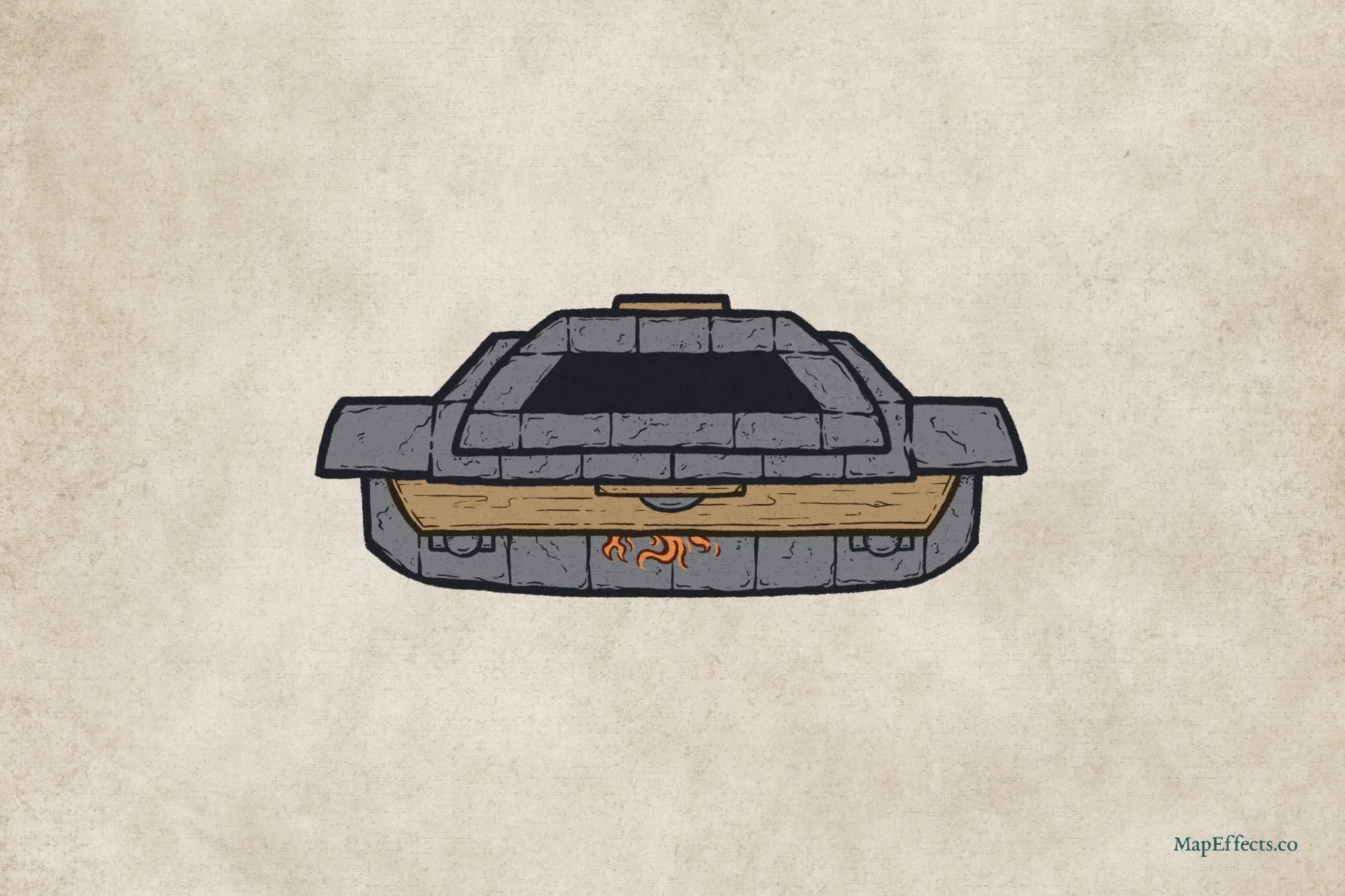
Block in Main Colors
If you’re working digitally like I am, just create a new layer below your line art and block in some colors. For the stone I went with more of a blue-gray just to contrast well with the warm colors of the wood, fire, and background.
Quickly Create Interior Maps with 400+ Features
Compatible with Procreate, Photoshop, Affinity, Infinite Painter, & Clip Studio
Easily create interior maps with a classic hand-drawn style for your next rpg campaign with a few clicks and a bit of imagination. Best of all, you don’t need to invest hundreds of hours learning to draw!
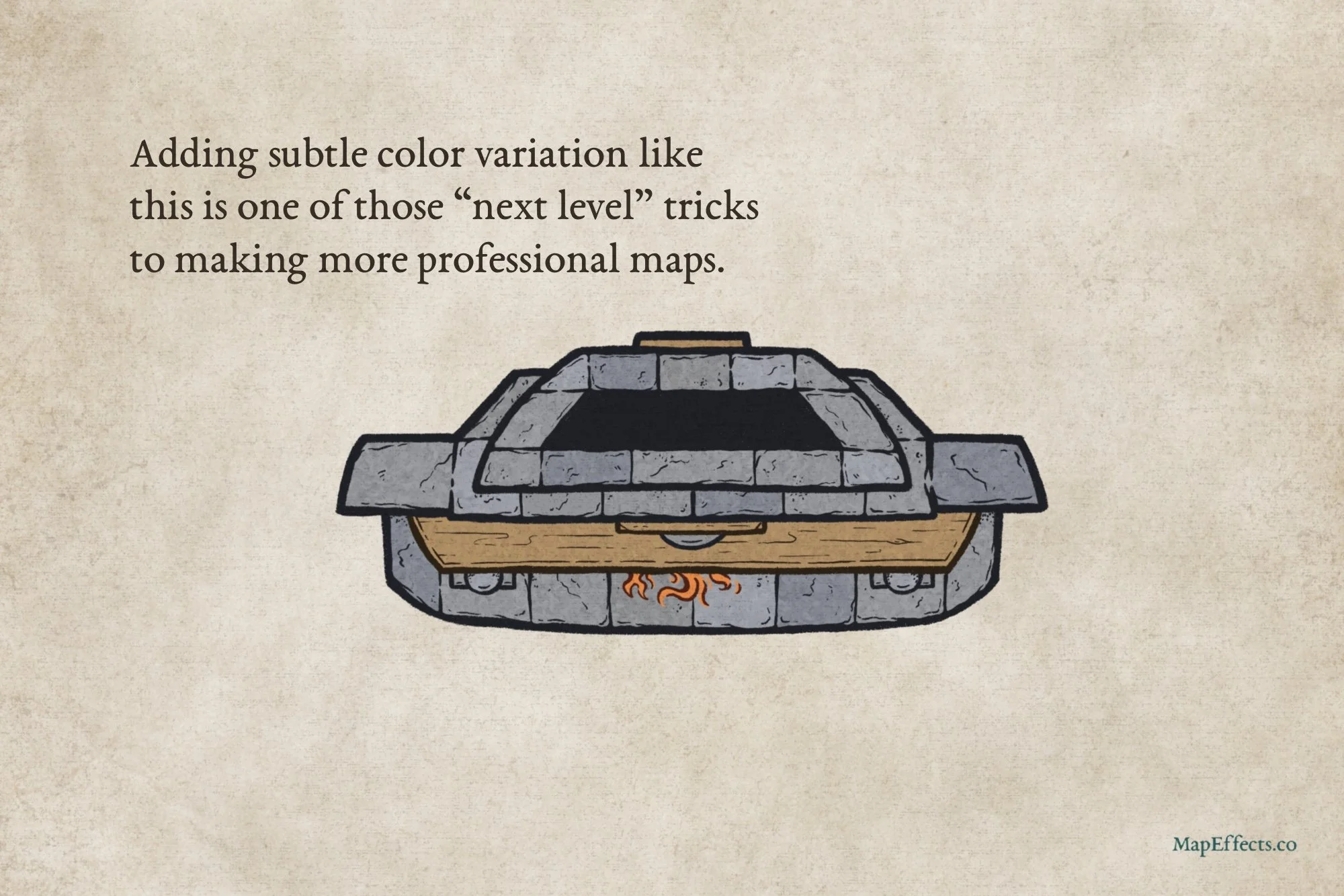
Pro Tip! Add Subtle Color Variation
You know how sometimes you encounter a little piece of information that has an exponential impact on improving your work? This is one of those moments. If you really want to improve the level of professionalism in your maps, then taking the time to add some subtle variations between repetive objects like these stones will make a big difference. Just shift the saturation, brightness, and hue slightly from your main color and recolor a few of the stones. If you compare the last two images, you can see that just by doing this the fireplace already looks more interesting.
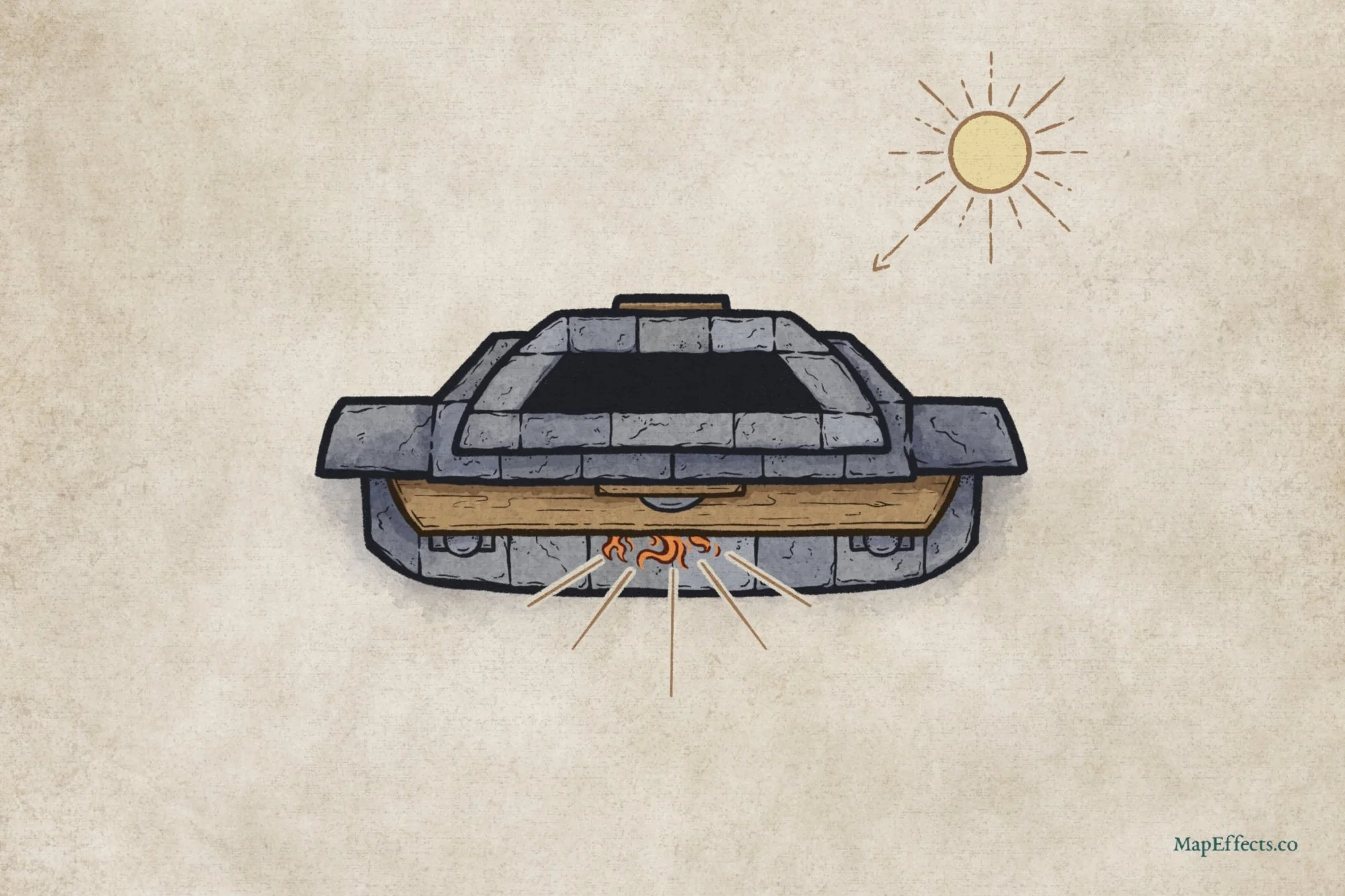
Paint the Main Shadows
Lighting in interior maps can be trickier than on a traditional fantasy map. Unlike those, where you generally have one light source, here you have two. I also tend to prefer focusing on conveying depth over strict realism. If you aim for realism, you may find the shadows are too intense and distracting. For overlapping objects, add a light shadow to the lower one. Corners can also benefit from subtle shading. However, as shown in my light direction sketch, I avoid shadows directly beneath the hearth near the fire to reflect its glow.
If working digitally, create a new layer below your line art but above your color layer. Set the blend mode to Linear Burn or Multiply, and use a blue-gray color for shadows. With a low-opacity brush, block in the main shadows, focusing on depth and light direction. We’ll add texture in the next step.
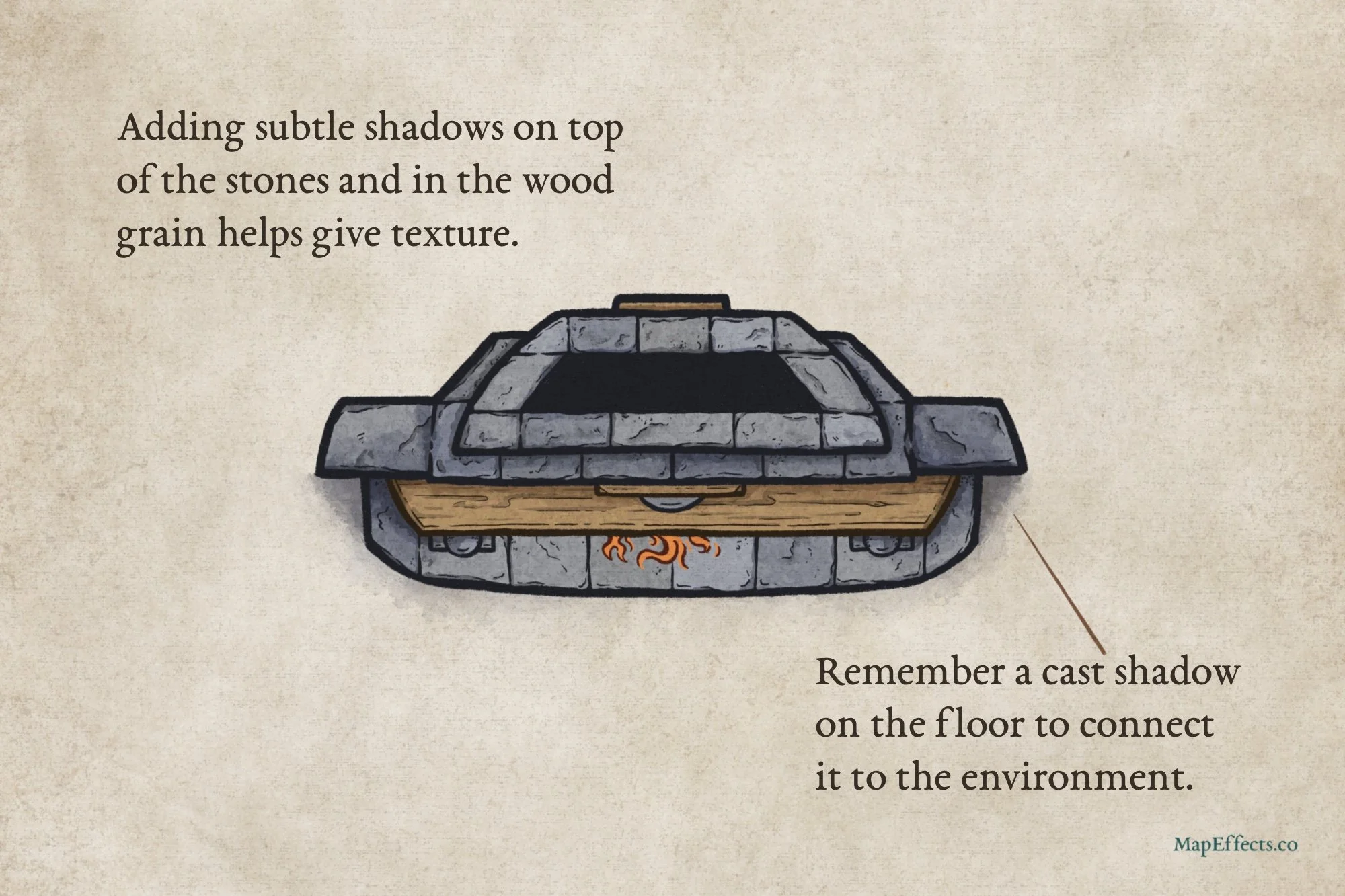
Deepen the Shadows
Now you can go back and deepen some of those shadows to bring out the depth. Be sure to also add a cast shadow on the floor, which will help connect the fireplace to the scene. Look for edges, cracks, and places where you added detail, and generally, they will all benefit from a bit of shadow.
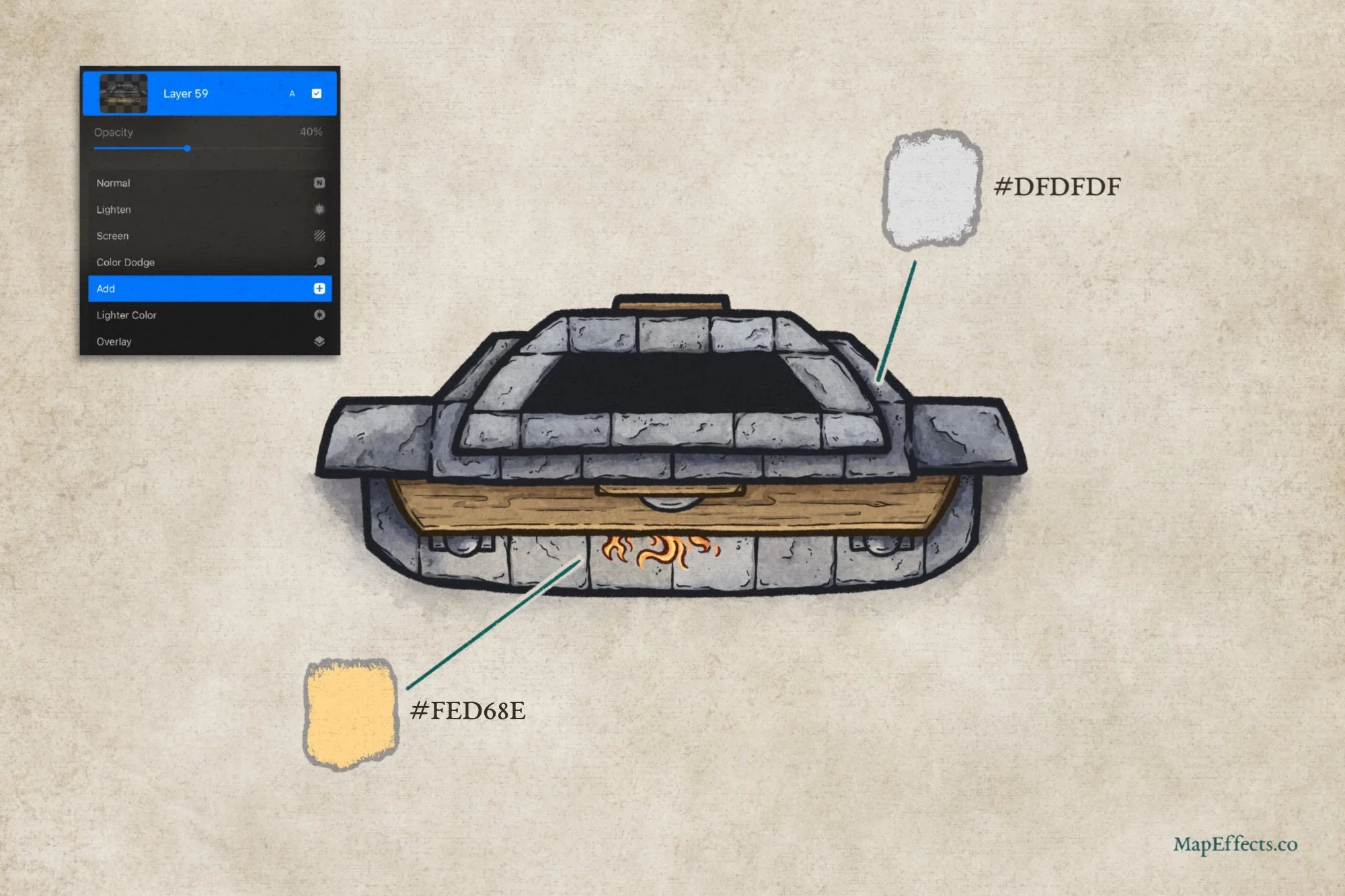
Paint in the Highlights
The final step is to add some highlights to increase the contrast and help everything pop. Create another new layer above your color layer, set the blend more to Add or Screen, and select one of these colors. I used more of a grey for the “outside” because I felt like it helped the warm color coming off the fire to stand out more. You’ll notice it more in the next step.
Use your low opacity brush like before and broadly paint in the highlights. You’ll notice from the screenshot in the corner that I like to paint a little more heavy-handed, and then I’ll lower the opacity of the entire layer. In this case, bringing it down to about 40% gave me the right balance.
Add Finishing Touches
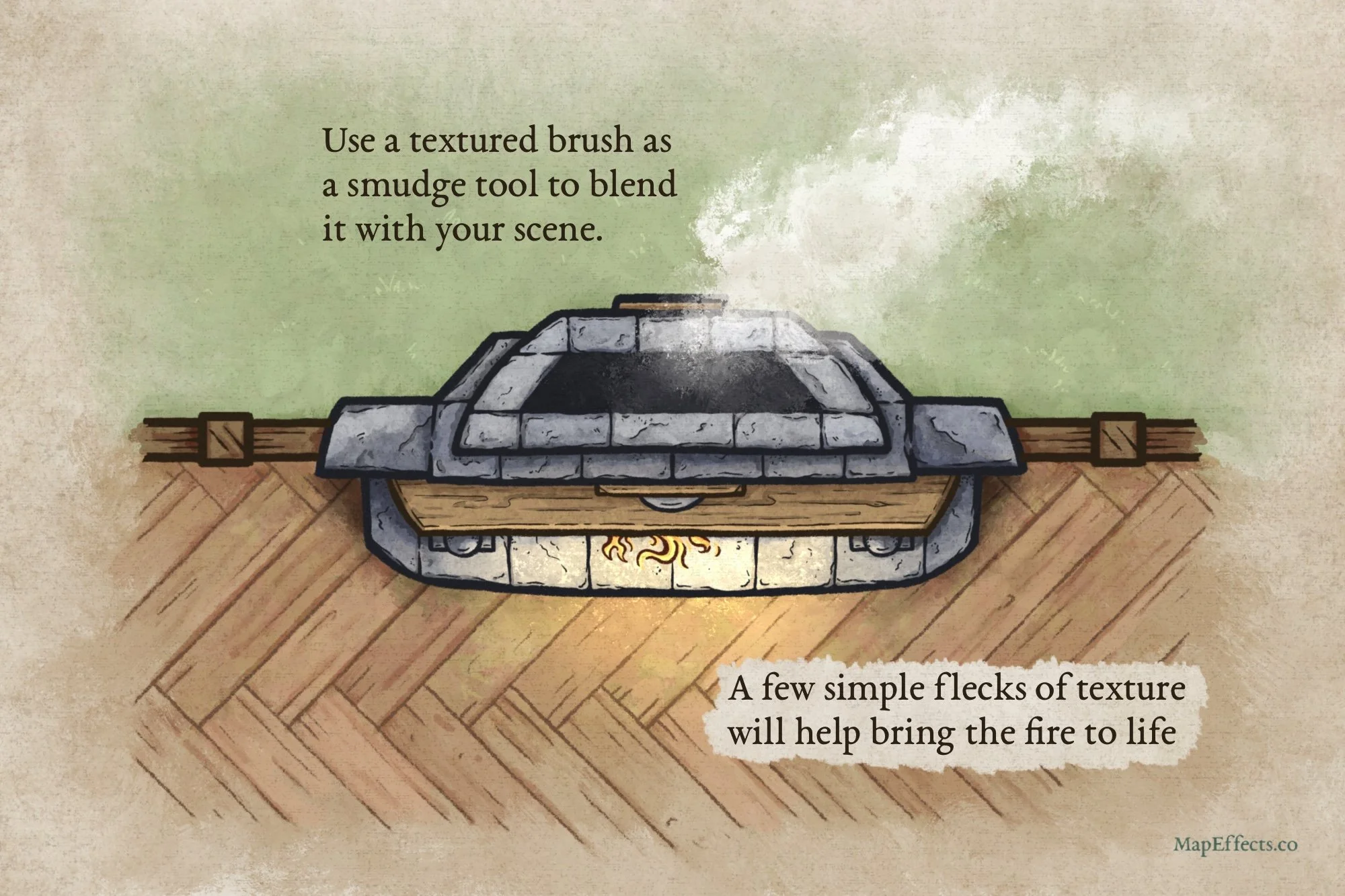
While I’m not going to cover it in this tutorial, I added a bit of an environment to our little map because it helps you see how the fire and the smoke pop when we add them.
The Smoke
Create a new layer above everything, including your line art. Set the blend mode to Screen, and with a light gray color and a textured brush, you can paint in a bit of a cloud coming out of the chimney. Rather than using a blur effect, I prefer to blend it and smudge the edges with another texture brush. It helps retain some painterly interest while allowing you to blend the smoke into the surrounding landscape.
The Fire
Add another layer with the blend mode set to Add and paint in more highlights with the same color as before. Finally, I took a bit of a rough stipple brush to just fleck in a few highlights right around the flames. This gives it a little more life and a bit of a crackling quality.
Thank You!
You’re done! I hope you found this helpful, so you can draw a fireplace on your next map! Be sure to check out some of the other tutorials below to help you in your map-making journey.
Happy Mapping!
Josh