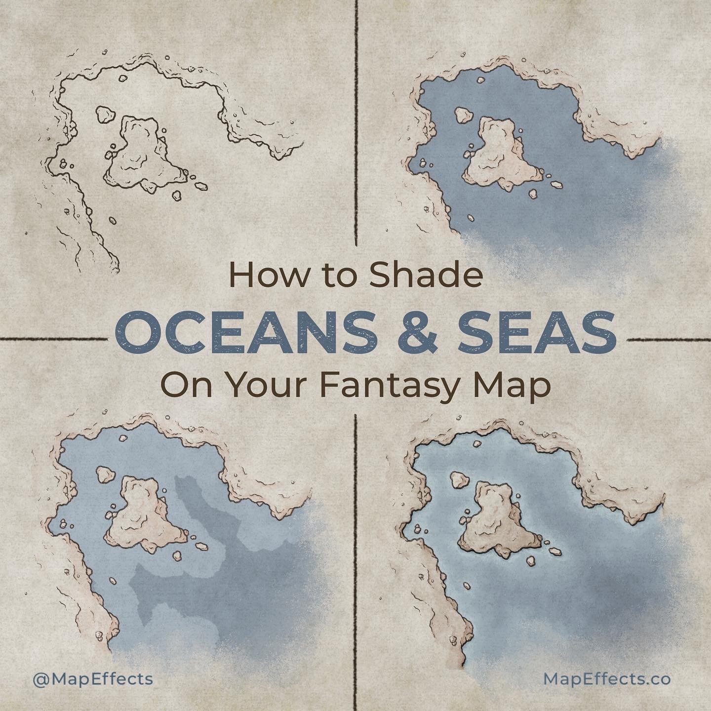
How to Shade Oceans & Seas on Your Maps

Let’s face it, the oceans on most fantasy maps are a bit neglected. It can be a challenge to make those large blank areas of your map interesting, so most of the time we resort to throwing in a compass, a few ships, and maybe a sea serpent. While there’s nothing wrong with adding some ships, in this tutorial I want to show you how to give your oceans & seas a little more character with the way you shade. Not only will you get a nice painterly texture, but this method is also a great way to hint at the topography just below the water’s surface.
All the brushes used in this tutorial are available in The Cartographer’s Liner Brush Field Kit for Procreate & Photoshop and the Free Apprentice Brush Pack
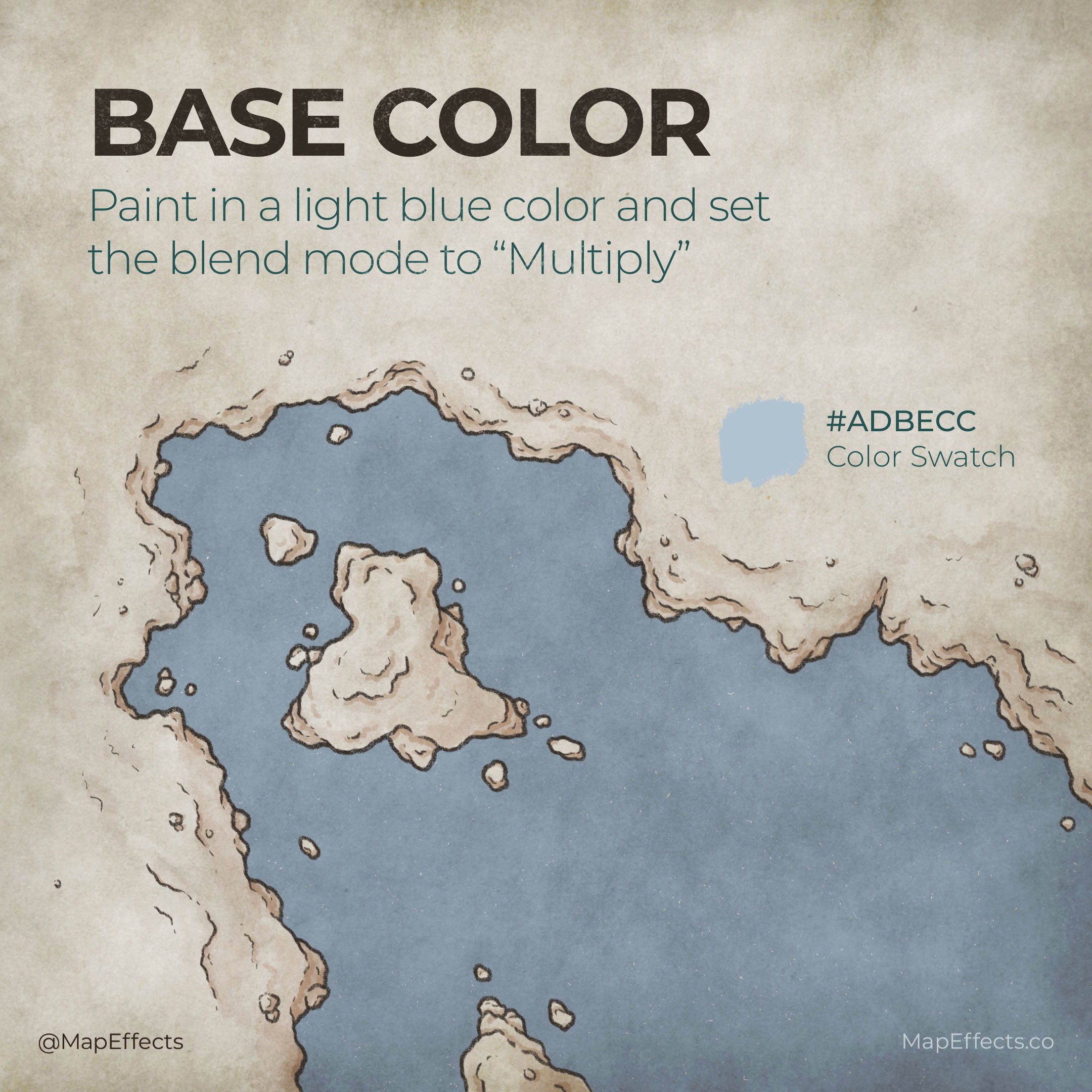
Add a Base Color
Create a new layer and paint a light blue color to fill in your oceans. Now set the layer to “Multiply”, which will bring out the paper texture in the background. If you need a paper texture, I’ve created a free pack for you to use on your maps which you can get by clicking the link below.
Get 25 Free Paper Textures HERE
For this example, I used #ADBECC as the base color, which on its own would probably be too light and saturated for my taste. But, when you use the Multiply blend mode, you’ll find it will darken the colors quite a bit, as well as pull out some of the saturation.

Follow the Shore
Create another new layer with a “Normal” blend mode and use the coastline as a guide to paint a lighter blue. This helps to indicate where the water is getting more shallow.
To pick your color, use the eye dropper tool on the base color, and then lighten it slightly. In this example, as the color lightens the hue also subtly shifts toward teal.
I am using the Heavy Marker Brush include in The Cartographer’s Liner Brush Field Kit because I like that the opacity is pressure sensitive so you can gradually build up the shading. Plus, it has a bit of paper texture built into it so you don’t lose your background texture.


Add Layers of Shading
Continue adding gradually lighter colors the closer you get to shore, until you have something like this. The lighter values show where the water is getting shallow. You can actually indicate quite a bit about what’s going on below the surface with this method.
You can also darken an area to indicate deeper water. In this example I again selected my base background color, darkened it, and shifted the hue toward the blues.
Now it’s time to start blending!
More Tutorials You May Enjoy

Smudge & Blend
Use a textured brush with some nice organic edges as a smudge tool to slowly blend all the shades. This is the trick to getting that nice painterly texture.
You can get the brush I’m using here for FREE in the Apprentice Brushes pack, which is compatible with Procreate, Photoshop, and Infinite Painter.
CLICK HERE to Get Your Free Brush
Quick Tip - Zoom Out!
I recommend working as zoomed out of your canvas as you’re comfortable with for this step. The reason being, if you zoom in close to try and make things “perfect”, there’s a good chance you’ll over-blend. You’ll lose out on the painterly edges of the brush and end up with an unnaturally smooth gradient that looks digital and fake.

Add Cast Shadows
Create a new layer and set the blend mode to “Overlay”. Now select the color black and paint where the shoreline would cast a shadow over the water. This can be as subtle or dramatic as you’d like but it helps add a little more depth.
Watch the Video Tutorial
You’re done! If you found this tutorial helpful be sure to follow MapEffects on Instagram and tag me with the map you create and I may feature your work. Thank you, and I look forward to seeing your map!
Josh